

Editing a Widget
In the admin: a Dashboard › a widget › Edit
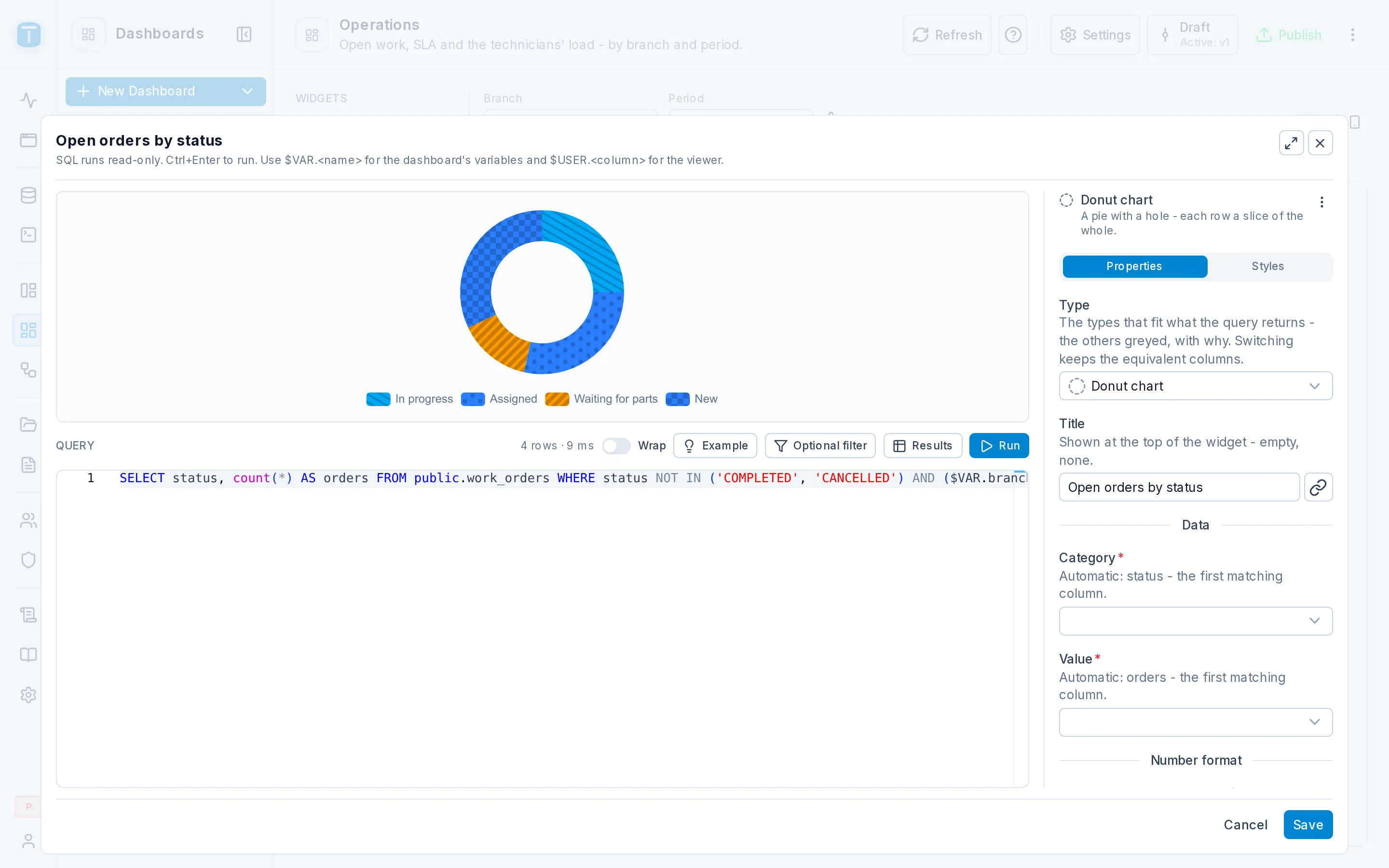
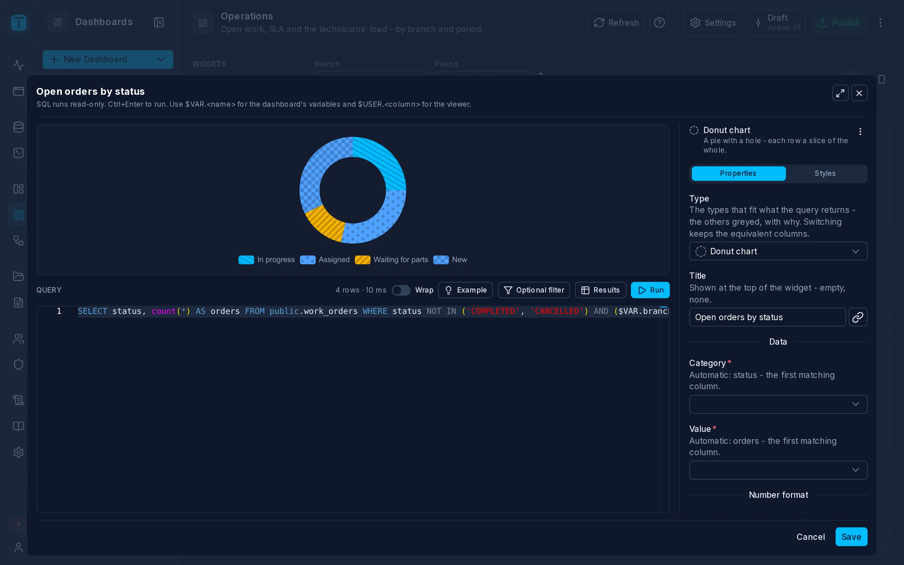
Edit on a card's ⋮, Configure on a new one, or a double-click on its header opens the widget drawer. On the left, the preview and the SQL editor; on the right, the inspector with Properties and Styles. Nothing is saved until Save; Cancel leaves the widget as it was.
On a phone, three tabs replace the two sides: Query, Preview and Settings.
The query
Write a SELECT in the editor. Opening a widget that has a query runs it at once. The toolbar:
| Run | runs the query as typed, with the variables bar's current values. Ctrl+Enter does the same. The preview redraws from the result |
| row count | 24 rows · 85 ms, marked (cut off at dashboards.query_max_rows) when the result reached the row cap |
| Wrap | wraps long lines. On by default on a touch device or a narrow screen |
| Example | what this type expects and a query that runs anywhere, with Use this query |
| Optional filter | writes the standard filter for a variable at the cursor (below). Only when the dashboard has variables |
| Results | shows the raw rows in a grid, to check columns and values |
Optional filter
Pick a Variable and a Column (or an expression such as wo.reported_at), and Insert writes the condition for its type:
| Variable | Inserted |
|---|---|
| Date range | ($VAR.period.from IS NULL OR wo.reported_at >= $VAR.period.from) AND ($VAR.period.to IS NULL OR wo.reported_at < $VAR.period.to) |
| Select | ($VAR.status IS NULL OR wo.status = $VAR.status); with several values, = ANY($VAR.status) |
| Text | ($VAR.search IS NULL OR c.name ILIKE '%' || $VAR.search || '%') |
| Number | ($VAR.year IS NULL OR extract(year FROM i.issued_on) = $VAR.year) |
While the variable has no value, the condition lets every row through. It's plain SQL: TotalBase never rewrites it.
text. To compare it with a uuid column, cast it: ($VAR.branch IS NULL OR wo.branch = $VAR.branch::uuid).How a query runs
The guarantees come from PostgreSQL, not from inspecting the SQL:
- Read-only. Each run is its own
READ ONLYtransaction. AnINSERT,UPDATE,DELETE, a data-modifyingWITHor a write inside a called function fails with SQLSTATE25006. - Always rolled back. The transaction never commits, so even a changed session setting doesn't outlive it.
- One statement. Stacked statements (
SELECT 1; DELETE ...) are refused before anything runs. A trailing;is fine. - A time limit. PostgreSQL cancels a query that runs longer than the instance's timeout (10 seconds by default).
- A row cap. At most the instance's row cap (1000 rows by default); the rest are cut, never paged, and the card says so.
- The viewer's time zone.
now(),date_truncand the date range presets cut days and months where the viewer lives.
The timeout and the row cap are instance settings: see Settings › Dashboards.
Variables are bound
$VAR.<name> and $USER.<column> become typed parameters: a text a viewer types is compared as a value, never run as SQL. $USER.<column> takes the column's real type and is read from the viewer's current row on every run; in the editor it's you. $USER.password_hash is refused, as is a variable the dashboard doesn't define or a hand-written $1. $INTERVAL and $PERIOD don't exist here: use PostgreSQL's now() - interval '7 days' and a Date range variable.
Properties
Type
The widget's type, by group. Once the query has run, a type that doesn't fit what it returns is greyed, with why: Bar chart needs at least one column of a number for Values. Switching keeps the query, the settings both types share and the equivalent columns (a chart's Category becomes a pie's Category, its Values the Value).
Title
The card's title. Empty, a data widget shows its type's name. The link button (Bind) beside it turns the title into a formula over the variables, the viewer and the query's first row: "Orders of " + {{vars.branch.label}}. When the formula gives a text, it wins over the literal title.
Data
A field per role: what each result column does in the widget, such as a chart's Category and Values. Each field offers only the columns of a kind it takes, each shown with its type and the table column it comes from. Unset, it says what it takes on its own: Automatic: total - the first matching column. Roles never pick a column by its name, and never a column starting with _.
Back to automatic (⊘) clears a choice. A role with several columns lists them in order: drag to reorder, Add a column… to add one. A column the query no longer returns is marked in error.
The type's own settings
Then the type's settings, in sections, only those the type has: Number format, Appearance, Series, Axes, Thresholds, Events, Zoom & export. A setting shows its default while unset; ⊘ returns it to the default. Each group's page lists them.
Number format shows the value column's own format greyed when it has one (Inherited from the column (total)…), with Edit in the table to change it for every screen. A format is a pattern: $ #,##0, #,##0.00, 0.0 % (the % doesn't multiply: 85 reads 85.0 %), CURRENCY:ARS. Compact number abbreviates large numbers (11.6M) and is on unless a format applies.
Events
On click sets what a click on a mark, a row or the card does:
| Action | Does |
|---|---|
| Filter this dashboard | sets one of its Select, Text or Number variables. In the App, Back takes it off |
| Open a DataView | opens it filtered, with a filter in the Data API's where grammar |
| Open a dashboard | opens another dashboard with its variables set, on a tab |
| Open a record | opens a DataView's record form by its key |
| Open a URL | opens an https address, in a new tab if you choose. Also in embeds lets it run in a public link or signed embed |
Values are formulas over the clicked row, {{row.<column>}} (its _ columns included), and the variables, {{vars.<name>}}. Tooltip line is the hint viewers see on hover. Only Filter and a URL marked Also in embeds run in an embed.
Card
| Setting | |
|---|---|
| Description | shown behind an ⓘ next to the title: what the widget measures |
| Text with no data | what it says with no rows. Default: No data for this period when the query reads a date range, else No data |
| On a phone | Automatic (half for a widget a quarter of the desktop wide or less, else the whole width), Whole width, Half, Hidden |
The inspector's ⋮ has Restore defaults: it clears the type's settings and keeps the card settings, the styles and the title's formula.
Styles
The common style block of every widget: margin, padding, border, radius, background, shadow and alignment, applied to the widget's body.
Next steps
- Indicators: the first group of widgets.
- SQL Conventions: colors and helpers from the query.
- Widgets: every widget's data roles and properties.