
Views
In the admin: DataViews › a DataView › Settings › Views
Views is how a list shows its rows. A list DataView (Table, Cards, Kanban, Calendar, Gantt, Map, Tree) can offer several views of the same rows: the same columns, filter and permissions, seen as a table, a board or a calendar. Users switch between them from the toolbar.
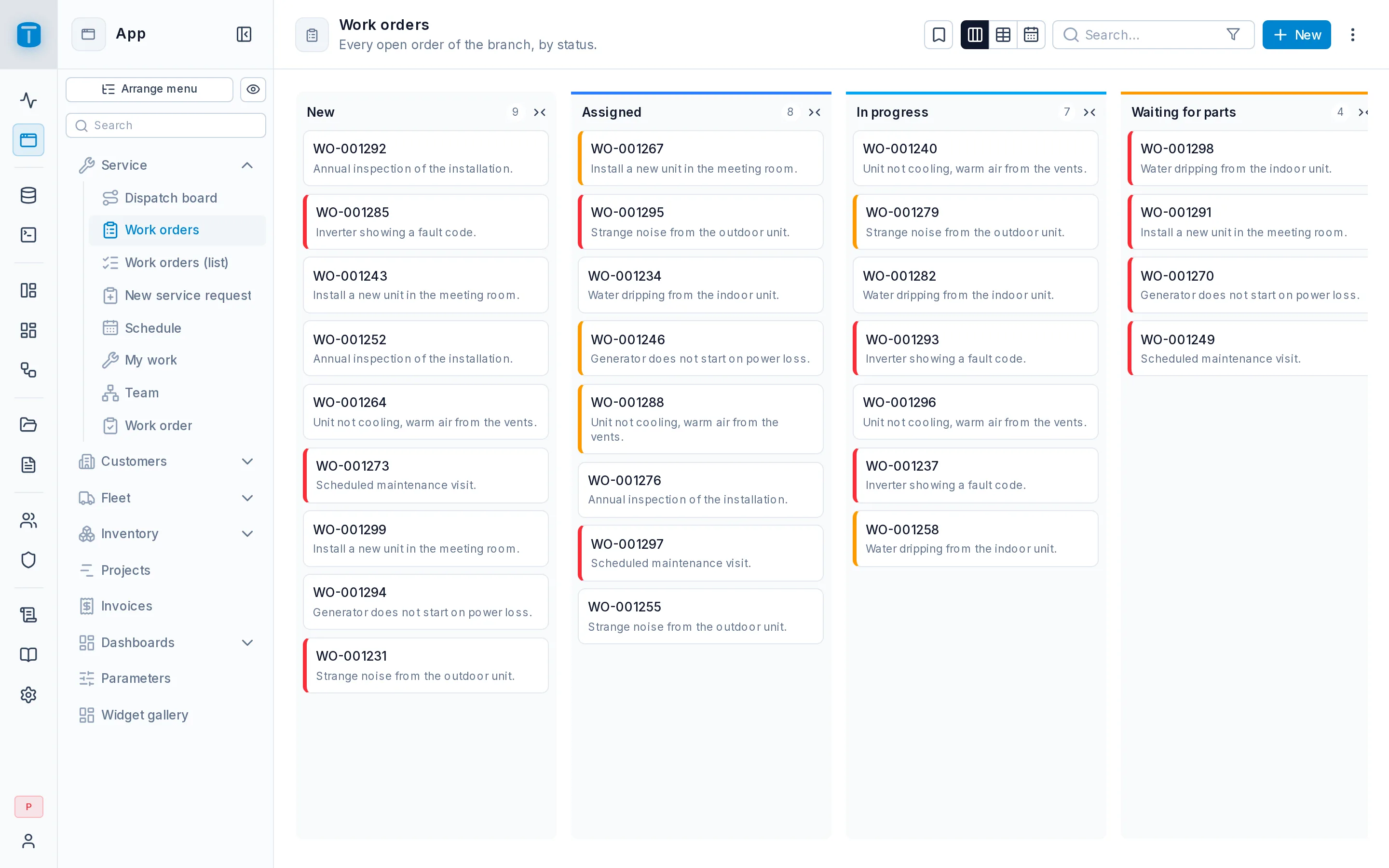
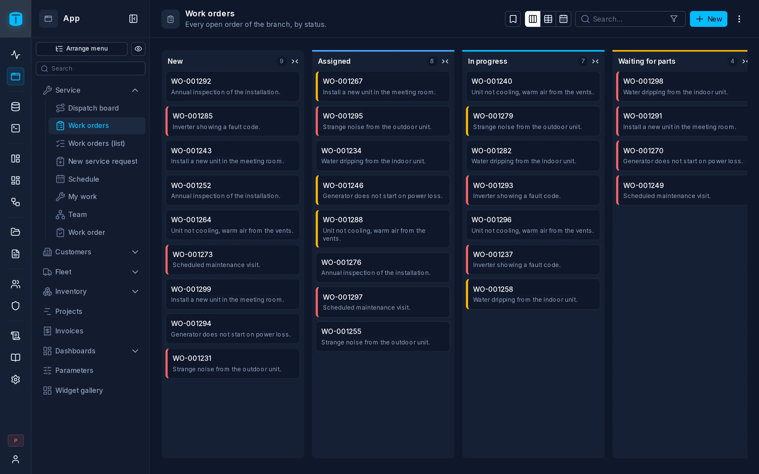
Acme's Work orders opens as a kanban for dispatchers, and also offers a table, to sort and export, and a calendar by due date.
Presentation
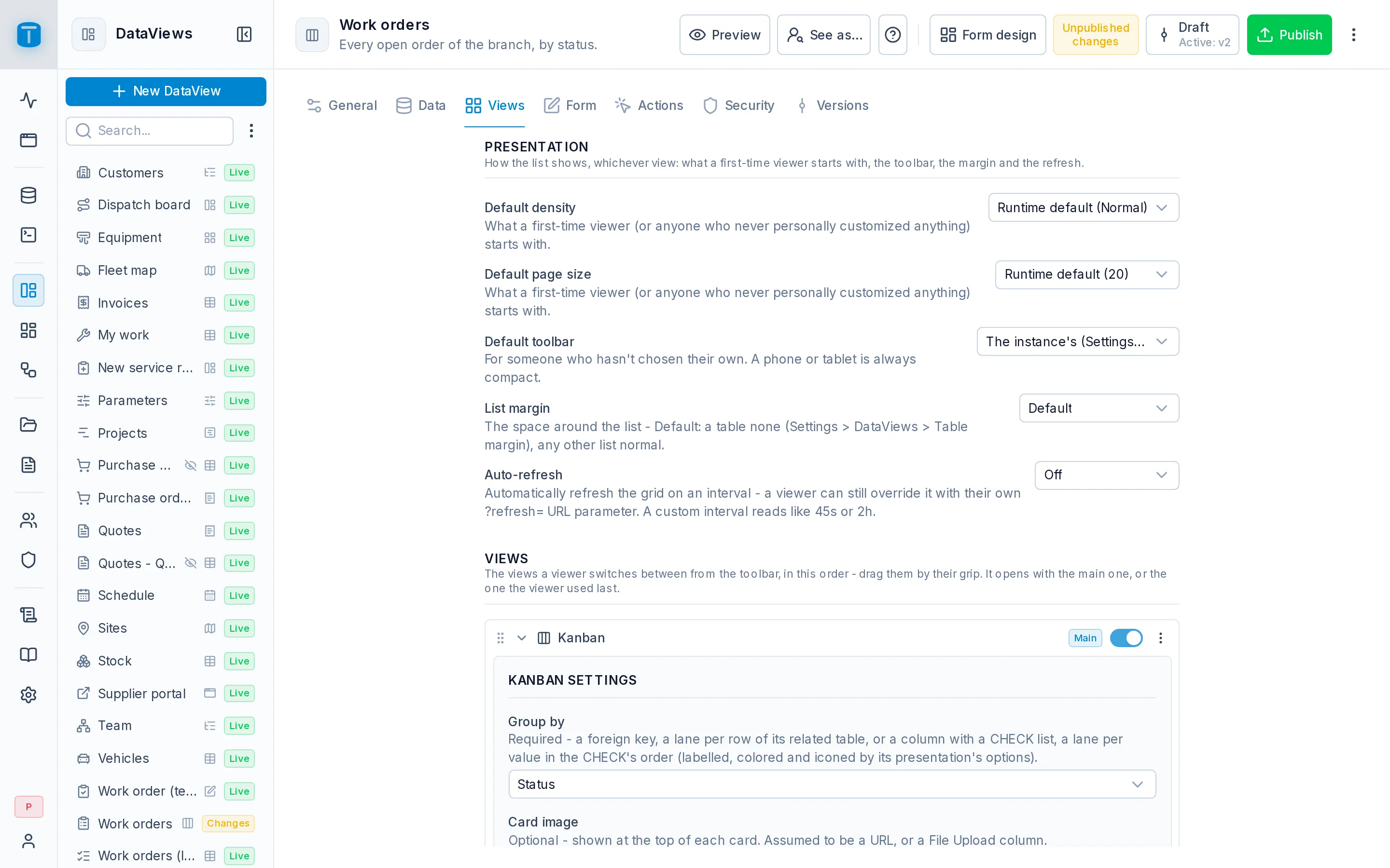
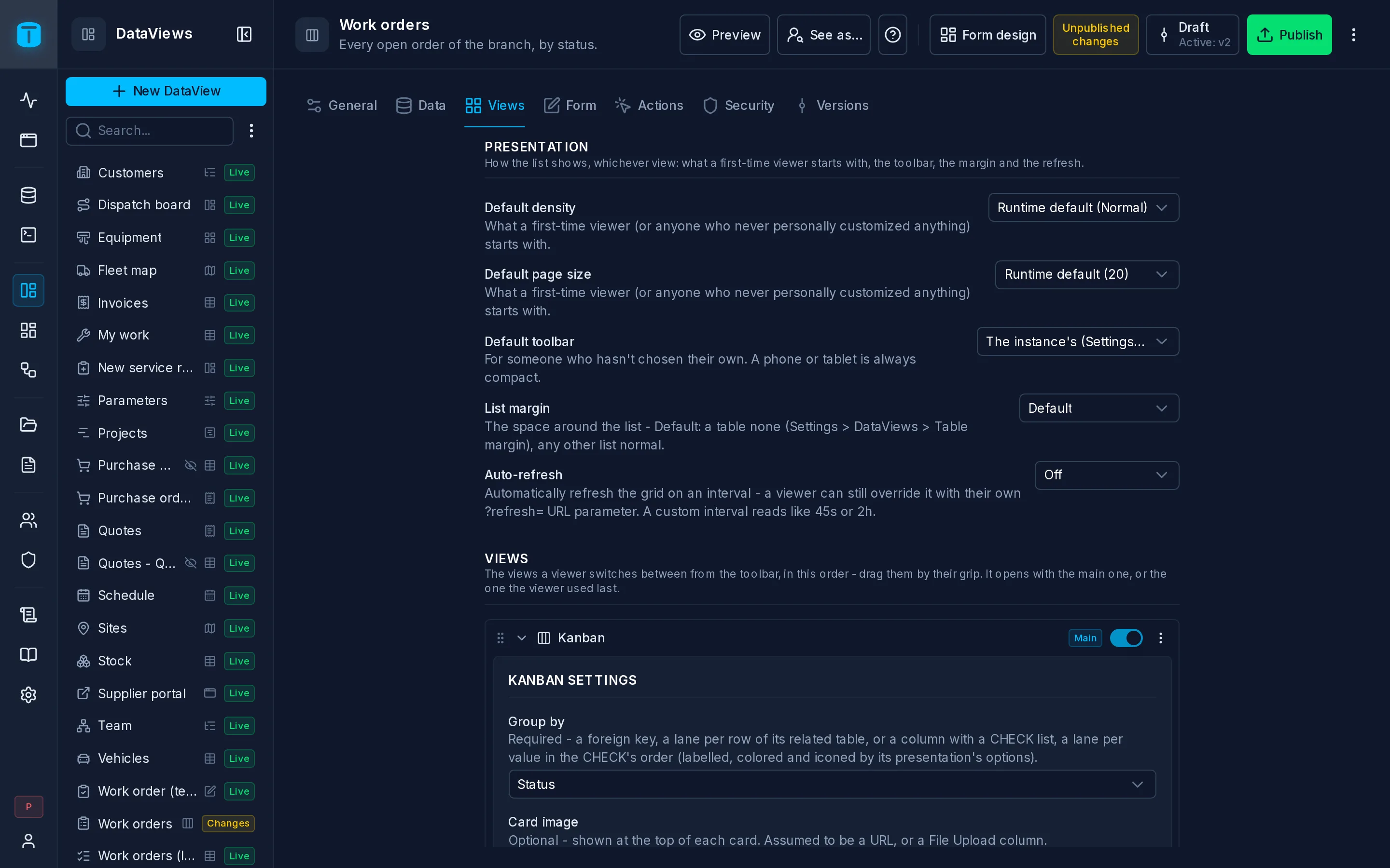
What every view shares. None of it is an action users take; it's how the list starts and behaves.
| Option | |
|---|---|
| Default density | The density a first-time user starts with, in a table and in cards |
| Default page size | 10, 20, 50 or 100 rows per page, in a table and in cards |
| Default toolbar | Full (every action a button), Compact (search and a ⋮ in the page header), or Default, the instance's (Settings › Features › DataViews). A phone or tablet is always compact |
| List margin | The space around the list: Normal, Compact or No margin, which puts a table right under the page header. Default takes the instance's for a table, Normal for any other view |
| Auto-refresh | Off, 10 s, 30 s, 1 min, 5 min, 15 min, or a custom interval. Acme's fleet map refreshes every 10 seconds |
A user's own choices (density, page size, toolbar, the columns they showed) are remembered for them and win over these defaults.
A link can set the refresh for one screen: ?refresh=30s at the end of the DataView's address, for a wall screen in the dispatch office.
The views
Below Presentation, one row per list view. A row's header has:
- a grip to drag it, and the view's icon and name;
- a badge: Main (the view the DataView opens with), Offered, Not offered, or Needs setup (offered, but its layout is missing a column);
- Offer, to offer it or not. It's off and disabled, with the reason, when the source can't show that view: a calendar needs a date column, a Gantt two, a map a point or two numeric columns, a kanban a foreign key or a
CHECKlist, a tree a foreign key of the table to itself; - a ⋮ with Make main, Move up and Move down.
The order of the offered views is the order of the switcher in the toolbar. Several rows can be open at once.
Open, a row shows the view's layout (the same fields as in the wizard, described on each type's page) and This view's controls: a table's Density, Columns, Print and Row edit, the cards' Card size.
Turning a view on proposes its layout from the columns. Turning it off keeps its layout for next time.
Main view
The Main view is the one the DataView opens with the first time, and the one its type is named after. Make main changes it. A list DataView stays a list: a Form or a Custom page can't become a view of one.
What users see
When more than one view is offered, the toolbar starts with a switcher: an icon per view. On a phone, the views are in the ⋮, under View.
The list reopens in the view each user used last. The toolbar, the available features and the margin follow the active view: switching to the calendar shows the calendar's own controls.