

Visualization and Insertion
In the admin: a Dashboard › a widget › Edit
These are presentation widgets: they arrange and explain a dashboard rather than chart a result. They're the same display widgets a DataView page uses, with the same settings. See Widgets. They draw as soon as they're added, with no query.
Formulas
A presentation widget's text, color and the like can be formulas, with the Bind button beside the setting. On a dashboard they read:
| Token | Reads |
|---|---|
{{vars.<name>}} | a variable's value |
{{vars.<name>.label}} | what the variables bar shows for it: an option's label, a preset's name |
{{vars.<name>.from}}, {{vars.<name>.to}} | a custom date range's bounds |
{{user.<field>}} | the viewer: id, email, name and the rest of their profile. Empty in an embed |
{{row.<column>}} | the first row of the widget's query |
{{rows}} | every row of its query: {{rows.length}} |
A presentation widget's query is optional. Write one in the drawer when its formulas need data; it runs read-only, like any widget's.
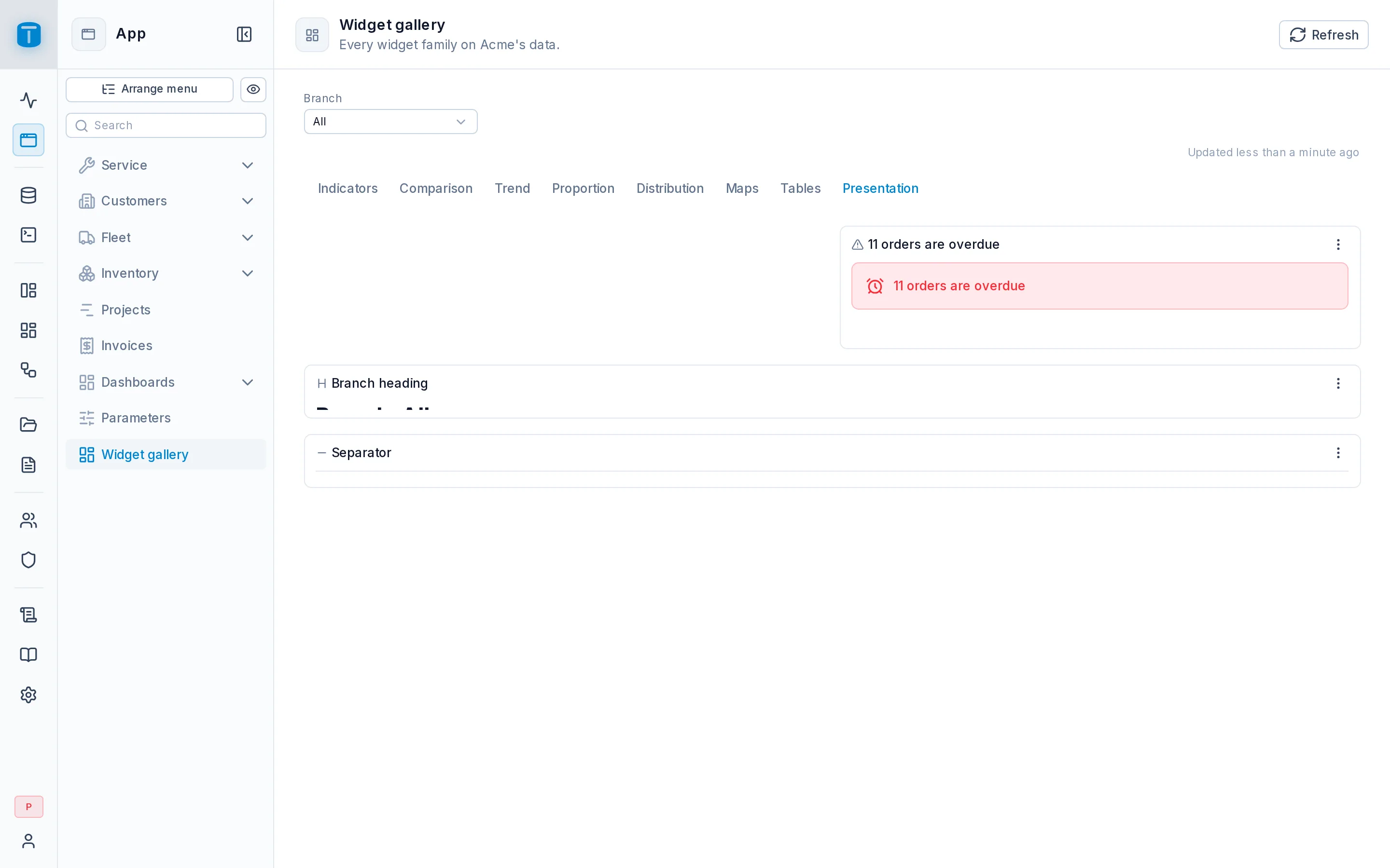
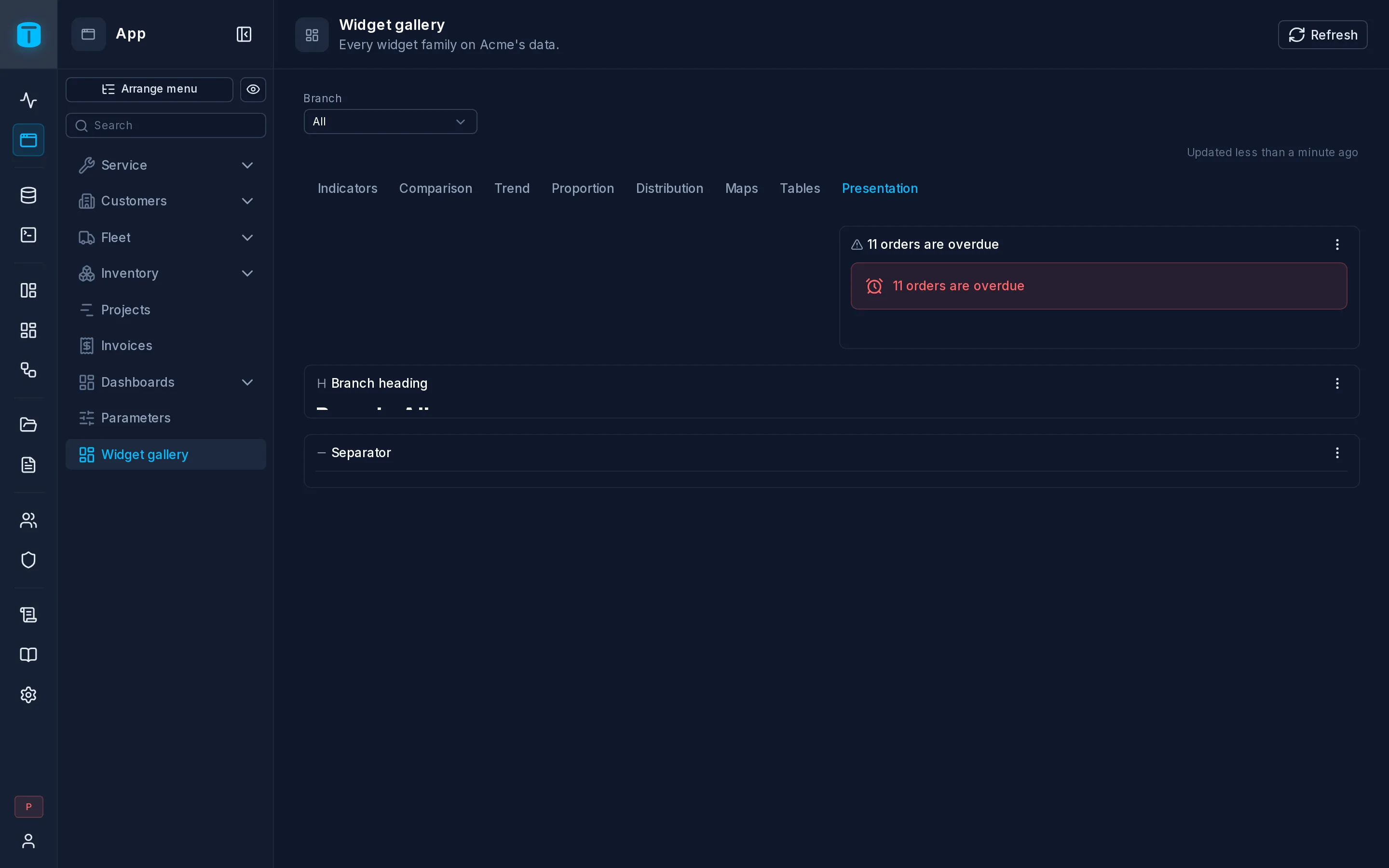
A heading that names the chosen branch, its Text bound to:
"Operations - " + IF(ISBLANK({{vars.branch}}), "all branches", {{vars.branch.label}})
An alert that counts overdue orders, with this query:
SELECT count(*) AS overdue
FROM work_orders
WHERE status NOT IN ('COMPLETED', 'CANCELLED') AND due_at < now()
and its Title bound to {{row.overdue}} + " orders are past due".
The widgets
| Widget | Shows | Main settings |
|---|---|---|
| Image | a fixed image: a logo, a branch's floor plan | an image uploaded in the editor or an https URL; alternative text, caption, shape, fit, corners |
| Heading | a section title | text, level (h1 to h6) |
| Text | a paragraph | text |
| QR code | a QR code of a value, drawn in the browser | value, size, error correction, a download button |
| Badge | a short label: a state, a count | label, color, variant, size, icon |
| Alert | a message with a title and a description | title, description, icon, color, variant |
| Separator | a rule between sections, with an optional label | label, line style |
An image uploaded in the editor is a public file: anyone who opens the dashboard sees it, an embed's visitors included. An http:// address or a private file is refused. To show a file the query returns, such as a technician's photo, bind the image to its column: {{row.photo}}.
Frame
Insertion › Frame shows another site's page in a sandboxed frame. Its URL may carry the dashboard's values after the site:
https://tracking.example/vehicles/{{row.plate}}?from={{vars.period.from}}
- The site is written out,
https://and its host; values go only after it, each URL-encoded. - TotalBase's own address isn't accepted.
- The values in the URL are sent to that site. Put in it only what the site may receive.
Its settings: URL, a title for screen readers, and Open in new tab, a button above it that opens the same page.
TFrame
Another site's page in a sandboxed frame - its URL may take , and values after the site.
Size: 6 × 5 of the 12-column grid, at least 3 × 3
A presentation widget: its props are the page widget's, see Frame. A query is optional; its first row feeds the props' formulas.
What they don't have
Presentation widgets have no roles, no number format and no On click. They always draw, so they have no Text with no data. Their card keeps a Description, On a phone and Styles. A data widget can't be switched into a presentation widget, or the other way round.
Reference
Image
TImage
A fixed image - a logo, a branch's floor plan: a file uploaded here (public) or an https URL.
Size: 3 × 3 of the 12-column grid, at least 1 × 1
A presentation widget: its props are the page widget's, see Image. A query is optional; its first row feeds the props' formulas.
Heading
THeading
A section title - a formula may name what is shown: "Sales of " + .
Size: 12 × 1 of the 12-column grid, at least 2 × 1
A presentation widget: its props are the page widget's, see Heading. A query is optional; its first row feeds the props' formulas.
Text
TText
A paragraph - its text a formula over the variables, the viewer and the query's rows.
Size: 6 × 2 of the 12-column grid, at least 2 × 1
A presentation widget: its props are the page widget's, see Text. A query is optional; its first row feeds the props' formulas.
QR code
TQrCode
A QR code of a value - a link to this report, a device's code - drawn in the browser.
Size: 3 × 3 of the 12-column grid, at least 2 × 2
A presentation widget: its props are the page widget's, see QR code. A query is optional; its first row feeds the props' formulas.
Badge
UBadge
A short label - its text and color may be formulas: a state, a count.
Size: 2 × 1 of the 12-column grid, at least 1 × 1
A presentation widget: its props are the page widget's, see Badge. A query is optional; its first row feeds the props' formulas.
Alert
UAlert
A message with a title and a description - a warning the query or a variable decides.
Size: 6 × 2 of the 12-column grid, at least 3 × 1
A presentation widget: its props are the page widget's, see Alert. A query is optional; its first row feeds the props' formulas.
Separator
USeparator
A rule between sections, with an optional label.
Size: 12 × 1 of the 12-column grid, at least 1 × 1
A presentation widget: its props are the page widget's, see Separator. A query is optional; its first row feeds the props' formulas.
Next steps
- SQL Conventions: presentation written in the query.
- Formulas: the formula language.