

General
In the admin: DataViews › a DataView › Settings › General
Settings is where you configure a DataView after creating it. Click a DataView in the admin's list to open it. Its sections run along the top, one question each: General (what it's called), Data (what it reads), Views (how the list shows), Form (how a record opens), Actions (what users can do), Security (who opens it) and Versions.
Which sections a DataView has depends on its type: a Form has no Views, a Custom page has a Page section instead of Views and Form, and a Settings DataView has Layout. Those are described on each type's page.
Every change is saved to the draft as you make it. The header shows the draft's state and holds Preview, Form design (Page design for a Custom page), Versions and Publish. Its ⋮ opens the DataView in the App or deletes it.
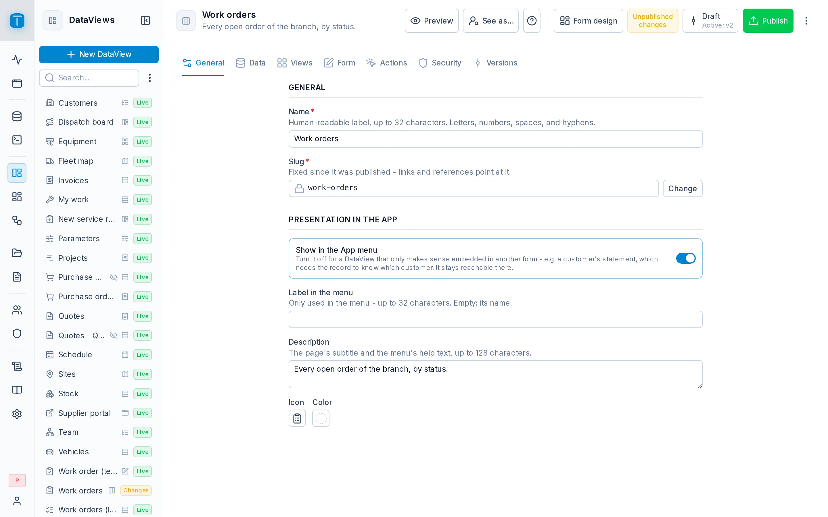
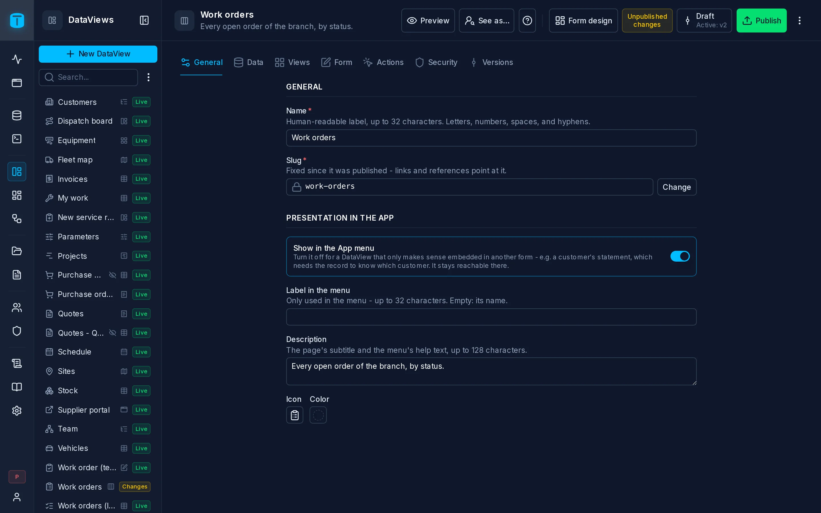
General
| Field | |
|---|---|
| Name | Required, up to 32 characters, unique. The DataView's name in the admin and, unless it has a label, in the App menu |
| Slug | Its address in the App: /admin/app/dataviews/work-orders. Proposed from the name until you edit it |
Once the DataView is published, the slug is locked, because links, embeds and other pages reach the DataView by it. Change unlocks it after a warning: everything that used the old address stops working.
Presentation in the App
How the App shows it. These fields aren't part of a version: they apply as soon as you change them.
| Field | |
|---|---|
| Show in the App menu | On by default. Turn it off for a DataView that only makes sense inside another, such as a customer's statement embedded in the customer's form. It keeps working there, and opens by its link for whoever may open it |
| Label in the menu | Optional, up to 32 characters. A shorter name for the menu: Orders for Work orders - all branches. Empty, the menu shows the name |
| Description | Optional, up to 128 characters. The page's subtitle in the App, and the menu entry's help on hover |
| Icon, Color | Optional. The menu entry's icon and its color. Without an icon, the type's |
The same label, description, icon and color can be set from the App menu's editor. See Arrange menu.
Next steps
- Data: the DataView's columns.