

Cards
In the admin: New DataView › Cards · Settings › Views › Cards
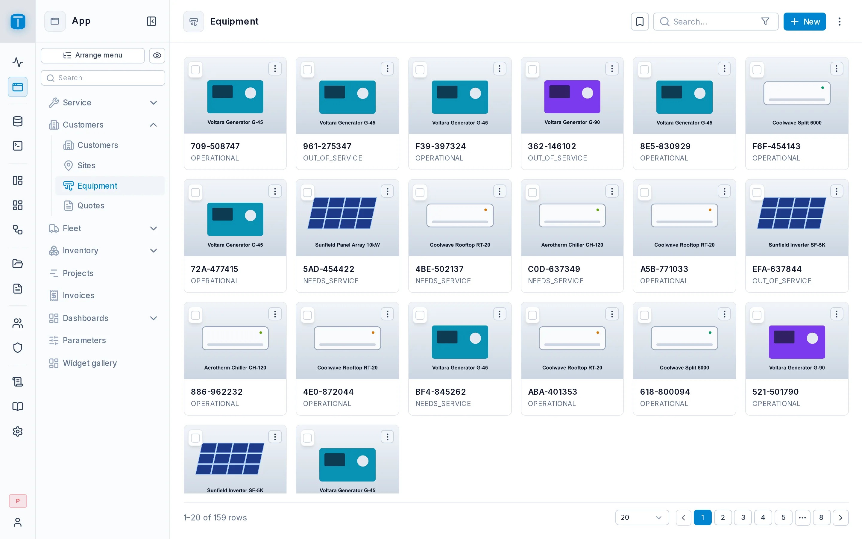
Cards show each row as a card with an image, a title and a description. Use them when a picture says more than a column: products, people, equipment, vehicles.
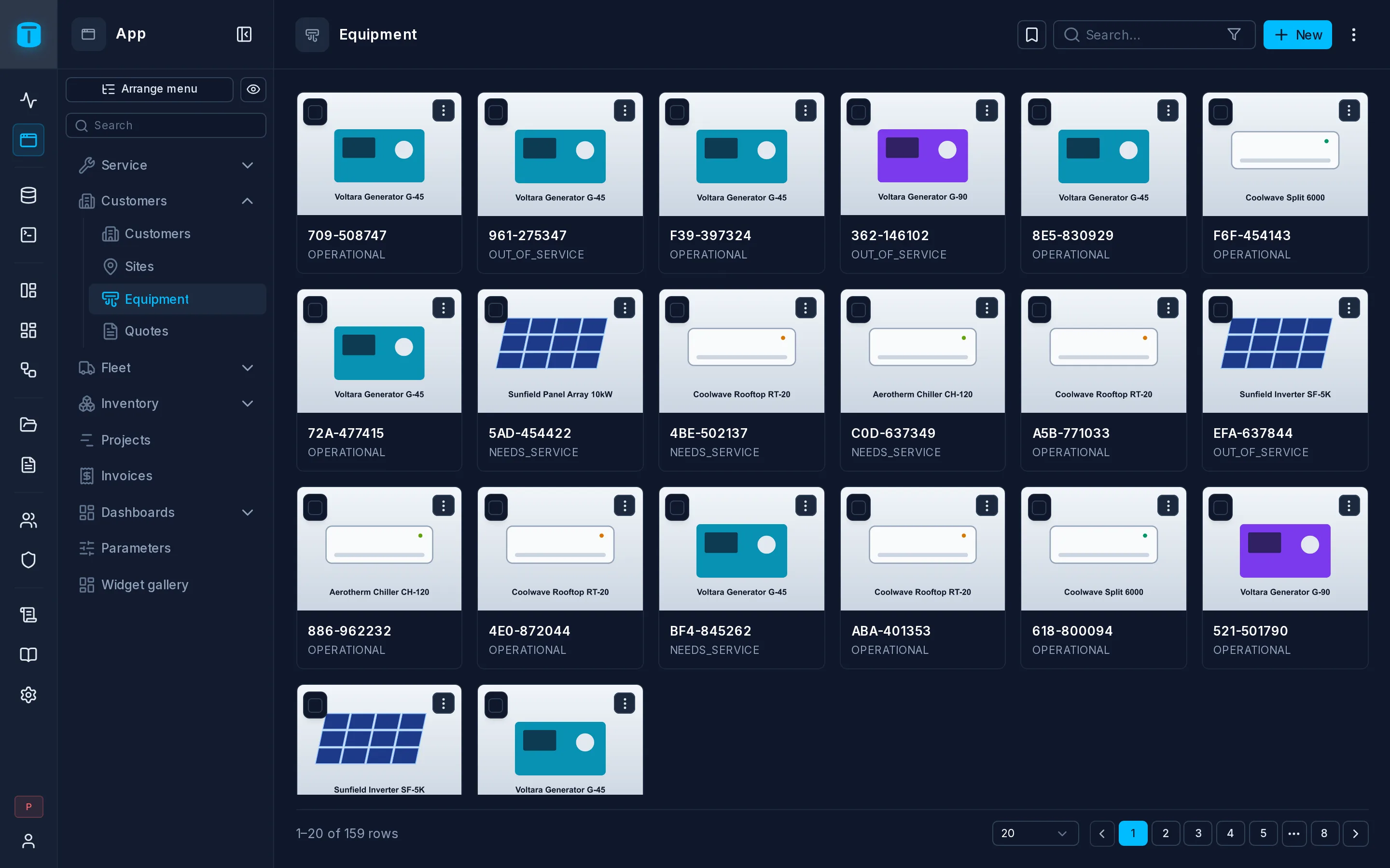
At Acme, Equipment shows each unit as a card with its photo, its model and serial, and its status.
What it needs
Any table or view. The image is optional: a URL column or a file column (see Files).
The layout
| Field | |
|---|---|
| Card title | Required. The card's headline |
| Card description | Optional, under the title |
| Card image | Optional |
| Image shape | Default (16:9), Original, 1:1, 3:4 or 4:3. 3:4 for a portrait photo |
| Image fit | Fill the shape (the default) crops the edges; Whole image shows all of it |
| Crop from | Center (the default) or Top, which keeps a face in a portrait |
Title, description and image each take a column or a formula: {{model}}, or CONCATENATE({{brand}}, " ", {{model}}) to combine several. In the wizard you pick a column; formulas are edited later in Settings › Views. See Formulas.
An image from a file column is fetched with the viewer's own access, like any other file read.
What users can do
- Open a record by clicking its card. Each card also has a ⋮ with the record's actions.
- Search, filter and page, as in a Table.
- Select cards to edit them together.
- Change the card size, remembered per user:
- Normal;
- Compact: narrower cards, the description on one line;
- Very compact: the image alone, with the title and description in a tooltip.
The image's shape, fit and crop never change with the size.
A row condition on one of the shown columns (an expired warranty, an item out of stock) marks the card with a colored edge, or dims it. See Settings › Data.
Settings › Views › Cards
The layout above, and Card size: whether users can switch the size. The size a first-time user starts with is under Presentation.
Next steps
- Kanban: the same cards, in lanes.
- Settings › Actions.